

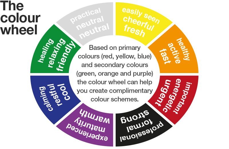
How colour can help
build healthcare teams
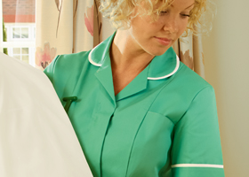
In the frenetic, often unpredictable environment of a major hospital or medical centre, colour is the easiest way to be recognised – this is why Alexandra offers the widest range of colour-matched workwear across a spectrum of medical and non-medical roles.
From your reception staff, through to nursing, specialists, surgery and care; from your maintenance, cleaning and auxiliary staff to food service, every team can share common colour themes that can be quickly understood by the customers and patients you serve.
Choosing specific colours for your team can also make a difference in helping your patients to feel at ease. Take a look at our simple colour guide that explores the meaning of a few of our most popular healthcare colours. All of these colours are available in a range of garments for both men and women.

White
Whilst white can be considered clinical, it is also the most reassuring colour for medical garments with the advantage that many other colours can be added as piping or epaulettes to denote different sections or levels within a single environment. It is the colour most members of the public expect to see in a hospital, especially worn by doctors and clinicians.

Yellow
Research into dementia has shown that patients are most likely to recognise the colours Blue, Red and green – but that bright, clear colours such as yellow, could be easily seen against busy backgrounds. Yellow is seen as fresh and rejuvenating as well as cheerful and childlike.
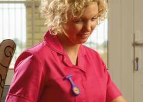
Pink
Whilst associated with women in particular, pink is also perceived as friendly, warm and approachable as well as being sensitive, caring and gentle.

Red
Traditionally seen as a warning sign, red also gives the impression of soliditity, seniority and security. Red is also seen as a colour that shows vitality and action. Tests show that the colour red can increase heart-rate and blood pressure.
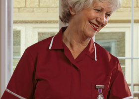
Burgundy
As a hue, made from both primary and secondary colours, burgundy can often be confused with blue or purple shades by older people. It is seen as a mature, established, solid colour that creates a feeling of warmth.
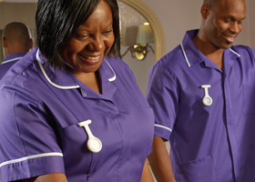
Purple
Traditionally associated with royalty, purple can also represent courage, power and control. Softer shades of violet and lavender become more friendly and relaxing.

Royal blue
A rich, strong shade of blue that has been a traditional nursing colour for many years. However, bear in mind that older patients may struggle to recognise darker shades of blue, mistaking them with black and purple.

Bright blue
Bright blue denotes crispness, cleanliness, efficiency and calmness. Patients see this colour as calming and reassuring.

Pale blue
Quietly reassuring, pale blue is seen as more calming and can be more easily seen by patients with reduced vision. Pale blue has long been considered the traditional colour for dental and midwifery uniforms.

Navy blue
A dark blue engenders trust, integrity and calmness. The colour is associated with experienced or managerial roles.

Dark grey
Strong, reliable and conservative, dark grey is a practical colour that looks professional and understated.

Pale grey
Very similar perceptions to pale blue – in terms of creating a neutral, unthreatening impression that can also been considered spiritual.

Dark green
Traditionally, dark green has been the colour of vetinerary practitioners – giving the impression of natural growth and health. The lighter the colour becomes, the more the colour denotes freshness, environmentally friendly, soothing and restfulness.
Aqua marine
A delightfully fresh mix of blue and green, associated with water and natural healing. As with other hues made from a mix of primary and secondary colours, this particular colour is often confused by older patients.

Aqua
Like Aqua marine above, this colour engenders a feeling of freshness, youth, and relaxation.